Creating modular layouts in React, part 1
When it comes to layout on the web, there is a sliding scale between fixed layouts and dynamic layouts. Fixed layouts place content in a consistent, predictable, and often predefined manner. The most common of these is the centered, singular column, used frequently for article layouts. However, fixed layouts can have multiple columns as well including areas like a sidebar, main content, a header, a footer, and all with different widths. In all of these situations though, the shared characteristic is that the placement of content is a constant. Everything has a home. The boundaries are clear. But what if the predefined content areas, don’t always fit our content needs? What if we want greater layout variety across our site?

the homepage of Kinfolk Magazine, a lovely expression of photography and lively grids.
Dynamic layouts (variety is the spice of life)
Dynamic Layouts place content in a systematic way, but with greater flexibility than fixed layouts. It treats the grid as a variable system where content can be easily placed and configured in a variety of ways.
A while back, I was building my portfolio site and found myself in need of this exact kind of layout. I wanted a way to emphasize, group, and isolate imagery with ease. In other words, I wanted each project to have a layout that best suited its content. Here is one of the solutions I arrived at:
Greater variation with CSS Grid
If you have had some experience with CSS Grid, then you are probably aware that these “dynamic layouts,” have become quite achievable to mere mortals. Now, you can use grid-template-columns for structuring your site, grid-column for spanning certain widths, and grid-column-starts and -ends to determine positioning.
However, most Grid approaches only provide partial solutions to creating truly maintainable, configurable, and dynamic layouts. As is often the challenge with code, the difficulty with dynamic layouts is not necessarily how to achieve it, but how to scale it. I needed to figure out how to create a flexible, modular grid system while upholding easy maintainability.
I ultimately decided that Dynamic Grids need to support the following:
- Multiple content sizes
- Custom content positioning
- Composable content sections
- Dependable responsive states
- Maintainable and reusable code
- Quick layout iterations
In the following sections, I’ll walk through how to achieve these goals using React and Styled Components.
- A working knowledge of React and Styled Components
- Comfortability with CSS
- You can find the code for this tutorial here on Github
Kicking off a new React project
Let’s see this approach at work in a new React site. First let’s create a new React App from our terminal:
cd <yourPreferredFolder>npx create-react-app layout-heaven
Next let’s switch into our new app folder and install styled components:
cd layout-heavenyarn add styled-components
Next up, let’s give our App.js and App.css a clean slate, and minimize the boilerplate. Here’s what I have:
// App.jsimport React from "react";import "./App.css";function App() {return (<div className="App"><h1>hello world</h1></div>);}export default App;
/* App.css */.App {max-width: 1440px;margin: auto;padding: 40px;}
A few more fixes. First, let’s update our background color to be a light grey. In index.css add the following to the body selector:
/* index.css */body {background-color: rgba(0, 0, 0, 0.1);/* other css properties */}
Next, let’s update our base font size:
/* index.css */:root {font-size: 10px;}
Finally, update the body font size to:
/* index.css */body {font-size: 1.3rem;/* other css properties */}
Setting up our Grid component
Next, let’s create a Grid component. This component will be responsible for providing our site’s layout. We will also take a mobile first approach, where all of our base styles will be mobile and then we will provide media queries for larger screen sizes.
To start, create a Grid folder in your src directory. Then, initiate a new index.js file in your Grid folder. Next, let’s create the skeleton for our Grid component in index.js.
// Grid/index.jsimport React from "react";const Index = () => {return <div></div>;};export default Index;
Now, import styled-components so we can start to define the CSS for our Grid component.
// Grid/index.jsimport React from "react";import styled from "styled-components";// ... React Component
Then create the following styled-component:
// Grid/index.jsimport React from "react";import styled from "styled-components";const Grid = styled.div`display: grid;grid-template-columns: 1fr;grid-column-gap: 40px;`;// ... React Component
This will create a grid system where each grid item occupies the remaining space, which will make all items full-width to start. Not particularly exciting, but it lays the foundation for our mobile-first version. The last initial piece to add is to ensure the Grid component will actually wrap our site’s content. To do this, we will render the Grid component’s children inside of it.
All together the Grid component looks like this:
import React from "react";import styled from "styled-components";const Grid = styled.div`display: grid;grid-template-columns: 1fr;grid-column-gap: 40px;`;const Index = (props) => {return <Grid>{props.children}</Grid>;};export default Index;
Setting up the Card component
Now we need to render some content containers for the Grid component. In your src directory, create a Card folder. In Card, create an index.js file.
Let’s go ahead and set up an initial React component and import styled-components:
// Card/index.jsimport React from "react";import styled from "styled-components";const Index = () => {return <div></div>;};export default Index;
Next, create the following styled-component:
const Card = styled.div`background-color: white;box-shadow: 4px 4px 4px rgba(0, 0, 0, 0.1);border-radius: 4px;margin-top: 20px;margin-bottom: 20px;display: flex;flex-flow: column wrap;text-align: center;transition: 0.25s ease-in-out;box-sizing: border-box;cursor: pointer;:hover {transition: 0.25s ease-in-out;box-shadow: 12px 12px 12px rgba(0, 0, 0, 0.2);}`;
This gives our Card component some nice base styling, and creates a vertical flow for any content placed inside of it. Like our Grid component, we will need to render the Card's children inside of it.
All together the Card component looks like this:
// Card/index.jsimport React from "react";import styled from "styled-components";const Card = styled.div`background-color: white;box-shadow: 4px 4px 4px rgba(0, 0, 0, 0.1);border-radius: 4px;margin-top: 20px;margin-bottom: 20px;display: flex;flex-flow: column wrap;text-align: center;transition: 0.25s ease-in-out;box-sizing: border-box;cursor: pointer;:hover {transition: 0.25s ease-in-out;box-shadow: 12px 12px 12px rgba(0, 0, 0, 0.2);}`;const Index = (props) => {return <Card>{props.children}</Card>;};export default Index;
Now, let’s see all of this in concert. Switch over to your App.js component, and import the Card and Grid component.
Next, update App.js component to the following:
// App.jsimport React from "react";import "./App.css";import Grid from "./Grid";import Card from "./Card";function App() {return (<div className="App"><Grid><Card>Header</Card><Card>Main</Card><Card>Footer</Card></Grid></div>);}export default App;
Here, we are rendering multiple Cards, all as children of the Grid component. And, you should now see the following:
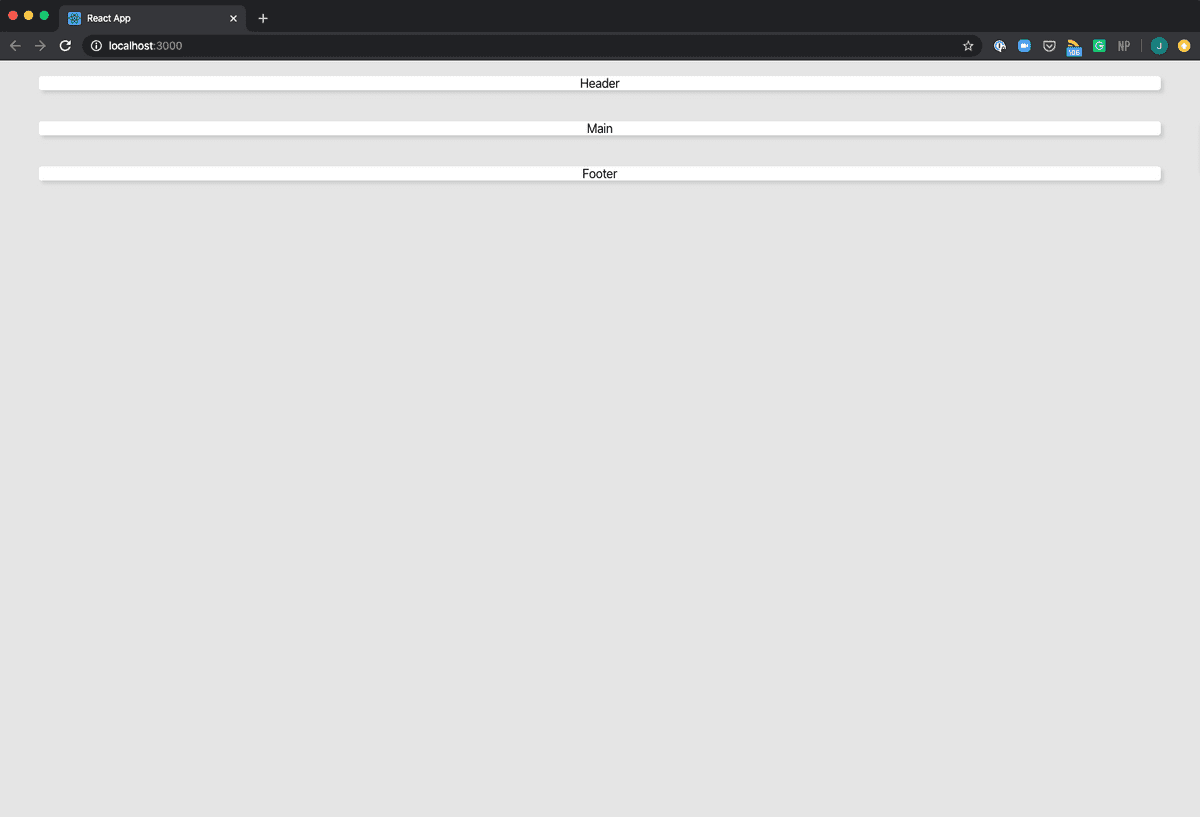
This is right, and it might feel underwhelming, but I promise it will get more exciting. Right now, we are still setting the stage.
Creating breakpoints
When writing code, I try to have a mindset of maintenance. I like the slogan “change once, persist everywhere.” A while back, I picked up this little trick for media queries that allows me to have a single source of truth for responsive breakpoints. We’ll implement this approach for our Grid component.
In our src directory, let's create a utils folder. We will keep helpful, site-wide functionality here. In utils, create a file called breakpoints.js.
Now provide the following code:
// utils/breakpoint.jsconst breakpoints = [540, 1080];export const mqs = breakpoints.map((bp) => {return `@media (min-width: ${bp}px)`;});
This creates an array of breakpoint strings, that we can now use in all of our styled components. We use min-width, because we are prioritizing mobile first for all of our default css styles. So at 540 we will transition into our tablet styles, and at 1080 we will transition into our desktop styles.
Column sizes
This portion of our setup will be the heart and soul of our entire site layout. We will determine all of our column, or content, sizes. We will be using a 12 column grid for desktop. The reason for this number, is that 12 enables a variety of content sizes and combinations and scales easily down to 6 columns for tablet. I’ve provided a few layouts below to help visualize how these different column sizes will work and look:
In our utils folder, let's create a new file called columnSizes.js. We will start by defining an object called columnSizes and populating it with multiple different content sizes: ones that easily add up to 12 for desktop and 6 for tablet.
// utils/columnSizesvar columnSizes = {xl: {desktop: "12",tablet: "6",},l: {desktop: "8",tablet: "6",},m: {desktop: "6",tablet: "6",},s: {desktop: "4",tablet: "3",},xs: {desktop: "3",tablet: "3",},xxs: {desktop: "1",tablet: "2",},};
The numerical value in this object will tell the sizes how many columns to stretch, or span, across. Next, up we need to create css classes for all of these sizes, so we can easily use them for any component. In addition, these classes will need to be strings, so we can use them in our styled components. In your columnSizes.js, add the following code:
// utils/columnSizes:export const desktopColumns = () => {var classes = "";for (let key in columnSizes) {classes += `&.${key} { grid-column-end: span ${columnSizes[key].desktop}}`;}return classes;};export const tabletColumns = () => {var classes = "";for (let key in columnSizes) {classes += `&.${key} { grid-column-end: span ${columnSizes[key].tablet}}`;}return classes;};
Here, we use the for in loop to iterate through our columnSizes object and create a class for each content size. grid-column-end tells css how many columns the content should span or stretch across. The output of calling these functions are css strings that we can then use in our styled components:
/* desktop classes */&.xl {grid-column-end: span 12;}&.l {grid-column-end: span 8;}&.m {grid-column-end: span 6;}&.s {grid-column-end: span 4;}&.xs {grid-column-end: span 3;}&.xxs {grid-column-end: span 2;}/* tablet classes */&.xl {grid-column-end: span 6;}&.l {grid-column-end: span 6;}&.m {grid-column-end: span 6;}&.s {grid-column-end: span 3;}&.xs {grid-column-end: span 3;}&.xxs {grid-column-end: span 2;}
The Column component
The hard work is about to pay off. Now, we will create our column component. This component will consume all of our columnSizes we previously set up. The column component will act as a wrapper for all of our content, automatically providing it with our preferred amount of space.
Let’s set up the skeleton structure of this component. We will need styled-components as well as our media queries and column sizes from our utils folder. In your src directory, create a new folder called Column with a file called index.js. In this file, provide the following code:
// Column/index.jsimport React from "react";import styled from "styled-components";import { mqs } from "../utils/breakpoints";import { desktopColumns, tabletColumns } from "../utils/columnSizes";const Column = styled.div``;const Index = (props) => {return <Column>{props.children}</Column>;};export default Index;
Now, let’s set up our styled component. It should provide all of the right column sizes for mobile, tablet, and desktop. Let’s see what this will look like:
// Column/index.jsconst Column = styled.div`grid-column-end: -1;${mqs[0]} {${tabletColumns()};}${mqs[1]} {${desktopColumns()};}margin: 0;`;
So, here, I am using my tablet and desktop media queries and rendering all of the corresponding classes and column sizes within it. Additionally, I am defining the default column style, mobile, to span the entire width of the screen.
There’s one last thing I’d like to do here. I want to spread the props across the Column component. This will allow me to define properties, like className, on my Column component when I use it which will automatically become available to my styled components.
// Column/index.jsconst Index = (props) => {return <Column {...props}>{props.children}</Column>;};
Making our Grid Responsive
Before, we start using this system, we need to make a few small updates to the Grid component. Switch over to your Grid/index.js component. So far, we have only defined a singular, full-width column for mobile. We need to add in a 6 column layout for Tablet, and a 12 column layout for Desktop.
First, let’s import our media queries into our Grid component.
// Grid/index.jsimport { mqs } from "../utils/breakpoints";
Next, we need to create a 6 column grid for tablet sizes that divides the space equally by 6. We can accomplish this quite easily using the css repeat keyword. In our Grid styled component, we will add the following:
// Grid/index.jsconst Grid = styled.div`display: grid;grid-template-columns: 1fr;${mqs[0]} {grid-template-columns: repeat(6, 1fr);}grid-column-gap: 40px;`;
Now, let’s add a 12 column grid for desktop sizes:
// Grid/index.jsconst Grid = styled.div`display: grid;grid-template-columns: 1fr;${mqs[0]} {grid-template-columns: repeat(6, 1fr);}${mqs[1]} {grid-template-columns: repeat(12, 1fr);}grid-column-gap: 40px;`;
Okay, time to take this for a test drive!
Grids, Columns, Cards, oh my!
Let’s wire this all up. Switch over to our App.js file. First, import our Column component at the top of this file:
// app.jsimport Grid from "./Grid";import Card from "./Card";import Column from "./Column";
Next, let’s update the App Component to use Columns:
// app.jsfunction App() {return (<div className="App"><Grid><Column><Card>Card 1</Card></Column><Column><Card>Card 2</Card></Column><Column><Card>Card 3</Card></Column></Grid></div>);
You should see the following:
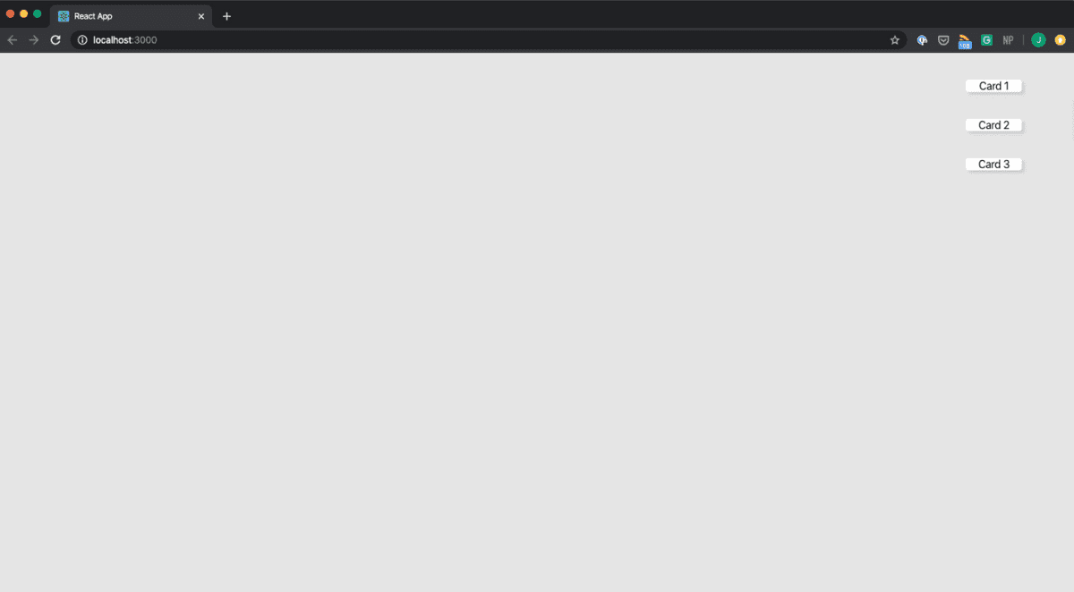
Not very exciting, let’s spruce this up a little bit. We will add in some of our classes to define different column widths:
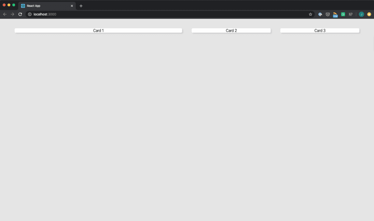
// app.js<Grid><Column className="m"><Card>Card 1</Card></Column><Column className="xs"><Card>Card 2</Card></Column><Column className="xs"><Card>Card 3</Card></Column></Grid>
Your site should now look like this:
If you view this in Firefox, and turn on the Overlay Grid option, you can see all of your grid lines:
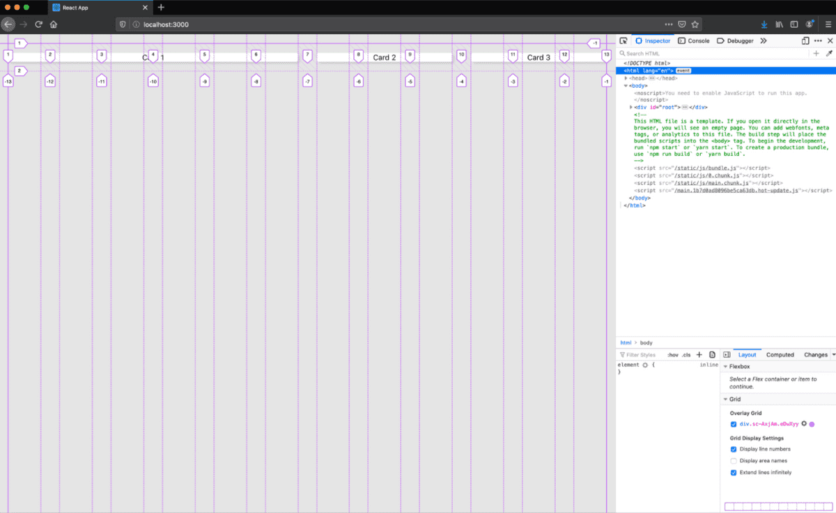
Our Grid is starting to show some promise. If you tried scaling this down, you probably noticed that this setup is completely responsive. So what’s happening here? Time to indulge in a smidge of math. Recalling the column sizes we defined for desktop, medium spans 6 columns, and small spans 3 columns. For desktop, we have a 12 column grid, and 6 + 3 + 3 = 12. Likewise, for tablet we have a 6 column grid, and medium spans 6 columns, and small spans 3 columns. This is why we end up with two rows on tablet.
Get fancy with it
Let’s create a nice image driven layout using our new Grid. In your src directory, create a new folder called Sections, in Sections create and switch into a new file called Top.js.
For this setup, we will need our Column and Card component. The component skeleton structure will look like this:
// Sections/Top.jsimport React from "react";import style from "styled-components";import Column from "../Column";import Card from "../Card";const Container = styled.div``;const Index = () => {return <></>;};export default Index;
Next, we’ll need some images. I really love the imagery on Pexels and it’s free for experimental use, so I’ll be using a few from there. After applying some base styles and sourcing a few images, here’s my Top component:
// Sections/Top.jsimport React from "react";import styled from "styled-components";import Column from "../Column";import Card from "../Card";const Container = styled.div`display: flex;flex-flow: column wrap;min-height: 400px;img {max-width: 100%;height: 200px;object-fit: cover;}font-size: 1.3rem;h3 {font-size: 2.1rem;margin-bottom: 0px;padding-left: 15px;padding-right: 15px;}h4 {font-size: 1.6rem;margin-bottom: 0px;padding-left: 15px;padding-right: 15px;}`;const Index = () => {return (<><Column><Card><Container><img src="https://images.pexels.com/photos/933054/pexels-photo-933054.jpeg?auto=compress&cs=tinysrgb&dpr=2&h=650&w=940" /><h3>title</h3></Container></Card></Column><Column><Card><Container><img src="https://images.pexels.com/photos/15382/pexels-photo.jpg?auto=compress&cs=tinysrgb&dpr=3&h=750&w=1260" /><h3>title</h3></Container></Card></Column><Column><Card><Container><img src="https://images.pexels.com/photos/1352196/pexels-photo-1352196.jpeg?auto=compress&cs=tinysrgb&dpr=2&h=650&w=940" /><h3>title</h3></Container></Card></Column></>);};export default Index;
A few things to note:
- The
Columncomponent is the primary wrapper component. - Within the
Columncomponent, I use a series of other wrapper components:CardandContainer. - The
<></>code is a JSX fragment which packages our component without creating an additional div. This will allow ourGridcomponent to treat eachColumnas a direct child and correctly position them. - The images use object-fit which causes them to expand to the edges of their container, while maintaining their aspect ratio.
Now let’s import and use our new Top component in App.js:
// App.jsimport React from "react";import "./App.css";import Grid from "./Grid";import Card from "./Card";import Column from "./Column";import Top from "./Sections/Top";function App() {return (<div className="App"><Grid><Top /></Grid></div>);}export default App;
If we view this in our browser it will look like the following:
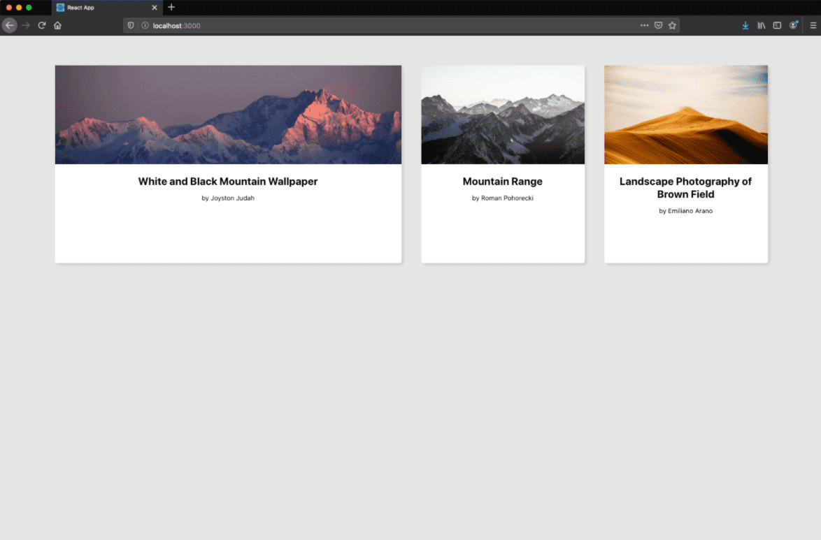
Fantastic. With our new grid and column components, we can try out multiple different configurations of our grid with minimal effort, and see how it scales. If you’re interested in seeing more setups, I have included a few configurations in my github repo. Here is one of my examples:

one of my layouts leveraging multiple card sizes and variations, even within a single row.
Overall, our grid accomplishes many of our goals:
- It accommodates multiple content sizes.
- It has composable content sections.
- It has dependable responsive states.
- It allows for rapid iteration.
- It has maintainable and reusable code.
And that’s a wrap! In the next part of this post, I speak to the last goal on our list: custom content positioning, and how to accomplish more organic layouts like the one showcased in my portfolio. If you’re interested, you can read that post now. Thanks for watching!