Managing global state with React Hooks
Before getting started, I’d like to preface this article with the suggestion that readers have some comfortability with React Hooks and Context. If you’re new to these ideas, I’d highly recommend checking out Alligator’s introduction and revisiting this article for some fun next steps.
For a quick recap, React Hooks enable developers to easily store and manipulate state within a component. A simple usage of a React Hook could be a counter component that starts with 0 and increments every time a user clicks it. When React released Hooks, they also released several modified syntactic features including Context. Context allows developers to store data that can be shared easily with any component throughout an app. Together we are going to use these two features to build out an app theme switcher.
Here’s a glimpse of what we will be building today:
You can access the final code on Github. Alright, let’s get started!
Spinning up a new React app
To begin, let’s create a new React app called “theme-switcher” from our terminal:
npx create-react-app theme-switchercd theme-switcheryarn start
Your React app should appear in your localhost. Next, we will create a clean slate for our our App component. Go ahead and update it the following:
// src/App.jsimport React from "react";import "./App.css";function App() {return <div className="App">Hello World</div>;}export default App;
Great, now let’s shift into setting up our Theme Context.
Creating the Theme Context
As we get ready to set up the color themes for our app, there’s essentially 5 tasks that we need to accomplish:
- Creating a Context component (provided by React)
- Passing values to our Context component (color values for a light and dark theme)
- Providing that Context to our entire app (so our components can access these themes)
- Consuming that Context throughout different components (so our components use the right colors for light and dark themes, respectively)
- Updating our Context (so our components can switch between light and dark themes)
Let’s start by creating our Context component. In your src directory, create a new folder called context. Within this folder, initiate a new index.js file. Then, provide the following code:
// src/context/index.jsimport React from "react";var { createContext } = React;export var Store = createContext();
Here, we destructure createContext out of React. Then, we call the createContext function and store the returned React component in a variable called Store. Store is a naming convention for an App’s centralized state. Lastly, we export it so we can use this component in our next component: the Provider.
Creating the Provider component
The Provider component will house our theme colors and ultimately provide our entire app with access to these colors. In the src directory, let’s create another folder called provider. Again, we will initiate this folder with and index.js file.
Now, let’s provide a skeleton React component:
// src/provider/index.jsimport React from 'react'const Index = () => {return()}export Index;
Next, let’s create a themes object for our light and dark theme:
// src/provider/index.jsimport React from 'react'var themes = {light: {text: "black",background: "white",primary: "#1FD2FF",card: "rgba(0,0,0,.1)",},dark: {text: "white",background: "black",primary: "#F2B4BA",card: "rgba(255,255,255,.2)",},};const Index = () => {return()}export Index;
Here, we are creating a few color values for different parts of our UI. We will eventually use these in React’s inline styles. Now, we need to populate our Store component with these theme values.
Before doing this, let’s take a look at how the Store, or Context, component works. React attaches two properties to every Context component:
- The
Providerproperty, responsible for providing state to its child components - The
Consumerproperty, responsible for consuming state from the Context Provider
We will start by creating the Provider component. To do this, import the Store component and then make the following updates to your React component:
// src/provider/index.jsimport React from "react";import Store from "../context/index.js";// ...theme object and values hereconst Index = () => {return <Store.Provider></Store.Provider>;};export default Index;
Additionally, the Store, or Context, component also accepts a property called value. This is where we can pass along any data, in our case the theme colors, to other parts of our app. However, we don’t just want to access theme colors, we want to toggle between them and cause a rerender of our app. We want all of our components to adopt the right colors every time we switch between light and dark modes. To do this, we will use React Hooks.
Setting up React Hooks
This part will involve a relatively small amount of syntax. At the top of our provider file, let’s destructure the useState function out of React:
// src/provider/index.jsimport React from "react";import { Store } from "../context/index";var { useState } = React;// ... React component here
Now, let’s create some initial state in our React component and pass it the value of themes:
// src/provider/index.jsimport React from "react";import { Store } from "../context/index";var { useState } = React;var themes = {light: {text: "black",background: "white",primary: "#1FD2FF",card: "rgba(0,0,0,.1)",},dark: {text: "white",background: "black",primary: "#F2B4BA",card: "rgba(255,255,255,.2)",},};const Index = () => {const [state, setState] = useState(themes);return <Store.Provider></Store.Provider>;};export default Index;
Next, we want to pass our state and setState to the value property on the Store component:
// src/provider/index.jsimport React from "react";import { Store } from "../context/index";var { useState } = React;// ...theme object and valuesconst Index = () => {const [state, setState] = useState(themes);return <Store.Provider value={[state, setState]}></Store.Provider>;};export default Index;
Fantastic, our Provider will now begin with the initial state of the themes object and also have the ability to update it.
There remain a few changes to the themes object we need to make. When we toggle between our light and dark themes, we will want to indicate the selectedTheme. We will also need to provide a mode for some conditional logic we will write later. Let’s add these values to our themes object and start with a default light theme and mode:
// src/provider/index.jsimport React from "react";import { Store } from "../context/index";var { useState } = React;var themes = {mode: "light",selectedTheme: {text: "black",background: "white",primary: "#1FD2FF",card: "rgba(0,0,0,.1)",},light: {text: "black",background: "white",primary: "#1FD2FF",card: "rgba(0,0,0,.1)",},dark: {text: "white",background: "black",primary: "#F2B4BA",card: "rgba(255,255,255,.2)",},};// ...react component here
Perfect! The last part we need to wire up is the Provider component’s children. Using React’s props.children, we can ensure that the Provider component will provide state to any components it wraps. All together, our updated component will look like this:
// src/provider/index.jsimport React from "react";import { Store } from "../context/index";var { useState } = React;var themes = {mode: "light",selectedTheme: {text: "black",background: "white",primary: "#1FD2FF",card: "rgba(0,0,0,.1)",},light: {text: "black",background: "white",primary: "#1FD2FF",card: "rgba(0,0,0,.1)",},dark: {text: "white",background: "black",primary: "#F2B4BA",card: "rgba(255,255,255,.2)",},};const Index = (props) => {var [state, setState] = useState(themes);return (<Store.Provider value={[state, setState]}>{props.children}</Store.Provider>);};export default Index;
Providing Context to our App
Now that our Store component is finished, we need to wrap our App component with it. Switch over to your app.js file and provide the following changes:
// src/app.jsimport React from "react";import "./App.css";import Provider from "./provider/index.js";function App() {return (<Provider><div className="App">Hello World</div></Provider>);}export default App;
And, that’s it. We can now proceed to create some content that uses our theme colors.
Create a Body component
In this section, we will create the foundations for our page layout. I will use certain css features, like grid, but I will not be diving into their details in an effort to keep the focus on React. However, if you’re curious, I have some good deep dives on building modular layouts with CSS grid. Alright, let’s get started.
In your src directory, create a new folder called body, and in it, initiate a new index.js file. Next, let’s populate this component with a some initial content:
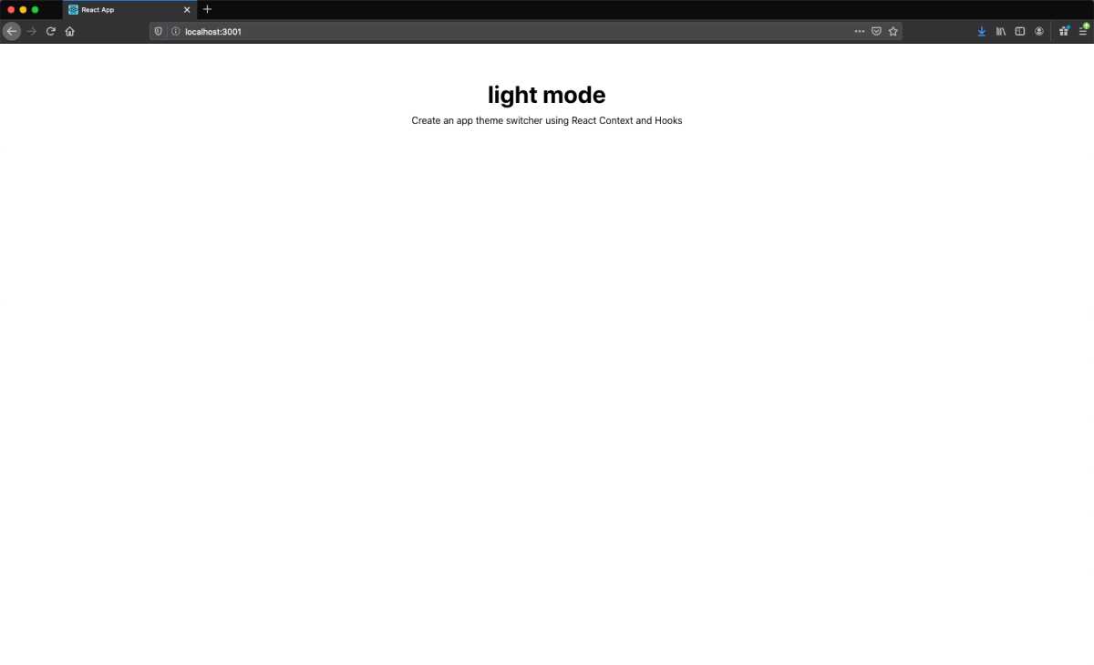
// src/body/index.jsimport React from "react";const Index = (props) => {return (<divstyle={{padding: "60px",minHeight: "100vh",margin: "auto",justifyContent: "center",alignItems: "center",}}><h1style={{marginTop: 0,marginBottom: "10px",fontWeight: "bold",fontSize: "40px",}}>light mode</h1><pstyle={{margin: "0px",marginBottom: "30px",}}>Create an app theme switcher using React Context and Hooks</p></div>);};export default Index;
Let’s see the results. Go ahead and import this into your App component and render it as follows:
// src/app.jsimport React from "react";import "./App.css";import Provider from "./provider/index.js";import Body from "./body";function App() {return (<><Provider><div className="App"><Body /></div></Provider></>);}export default App;
You should now see the following in your localhost:
Integrate theme styles into the Body
Now for some fun. Let’s start integrating a few of our theme styles into our body component. We already wrapped our app with our Provider component, which means any component can now access our themes. To do this, we will leverage React’s use context hook.
If you recall, React provides two properties on the Context component: Provider and Consumer. In earlier versions of React, developers had to use the Context Consumer syntax to access the data in the Provider. Now, developers can simply grab the Context data with useContext.
Go ahead and switch over to the body component. Our context data resides in our Store component, so let’s import it:
// src/body/index.jsimport React from "react";import { Store } from "../context/index.js";// ... React Component here
Now, let’s tell React which Context we would like to use. In our case, we want the Context, or data, from the Store component. Once we call the function useContext(Store), it will return the data we provided in the Provider component, which was state and setState. We can accomplish all of this using array destructuring:
// src/body/index.jsimport React from "react";import { Store } from "../context/index.js";var { useContext } = React;const Index = (props) => {var [state, setState] = useContext(Store);return (// ... more jsx here);};export default Index;
Perfect! Now we can access all of our theme colors through state (likewise we can update them through setState).
Let’s apply some of the colors from the selectedTheme object to our inline styles:
// src/body/index.jsimport React from "react";import { Store } from "../context/index.js";var { useContext } = React;const Index = (props) => {var [state, setState] = useContext(Store);return (<divstyle={{padding: "60px",minHeight: "100vh",margin: "auto",justifyContent: "center",alignItems: "center",backgroundColor: state.selectedTheme.background,}}><h1style={{marginTop: 0,marginBottom: "10px",fontWeight: "bold",fontSize: "40px",color: state.selectedTheme.text,}}>light mode</h1><pstyle={{margin: "0px",marginBottom: "30px",color: state.selectedTheme.text,}}>Create an app theme switcher using React Context and Hooks</p></div>);};export default Index;
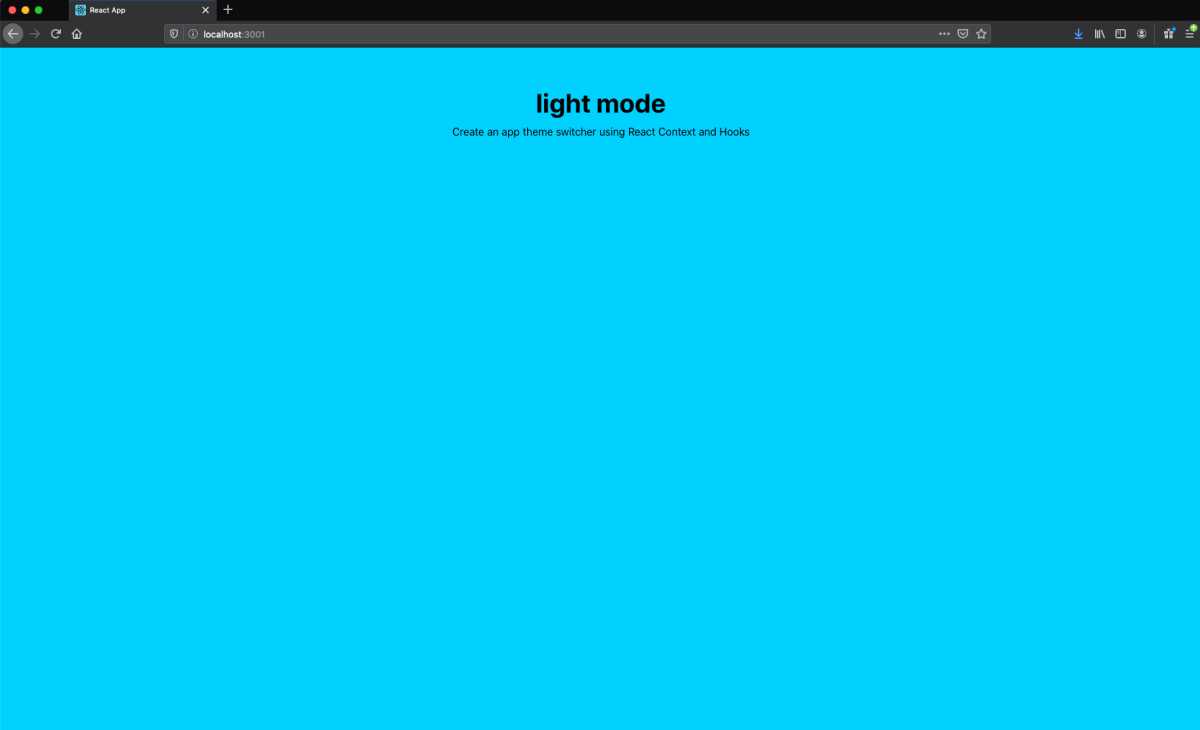
While there’s no noticeable difference, our body component is now using our selected theme, which defaults to light. For testing purposes, we could easily switch our div background color to the primary color:
backgroundColor: state.selectedTheme.primary;
which would render:
but, let’s revert that back to:
backgroundColor: state.selectedTheme.background;
and we should now see:

Building a theme toggle
Currently, we have the ability to consume the selectedTheme styles but no way to toggle between light and dark mode. Let’s create a button that will achieve that.
In your src directory, create a new folder called themeToggle and inside of it initiate a new index.js file. Let’s give this button a basic component structure:
// src/themeToggle/index.jsimport React from "react";const Index = () => {return <button>Toggle Theme</button>;};export default Index;
Next, let’s add some base styling:
import React from "react";const Index = () => {return (<buttonstyle={{outline: "none",border: "none",borderRadius: "4px",paddingLeft: "30px",paddingRight: "30px",paddingTop: "15px",paddingBottom: "15px",textAlign: "center",fontWeight: "bold",fontSize: "14px",cursor: "pointer",}}>Toggle Theme</button>);};export default Index;
Now, we will want to gain access to our themes through the Store Context. We will leverage the same useContext approach that we implemented in our Body component:
// src/themeToggle/index.jsimport React from "react";import { Store } from "../context/index.js";var { useContext } = React;const Index = () => {var [state, setState] = useContext(Store);return (<buttonstyle={{outline: "none",border: "none",borderRadius: "4px",paddingLeft: "30px",paddingRight: "30px",paddingTop: "15px",paddingBottom: "15px",textAlign: "center",fontWeight: "bold",fontSize: "14px",cursor: "pointer",}}>Toggle Theme</button>);};export default Index;
Now that we have access to our themes through state, we can go ahead and use some of the colors in our button. Let’s use the primary color for our background color:
// src/themeToggle/index.jsimport React from "react";import { Store } from "../context/index.js";var { useContext } = React;const Index = () => {var [state, setState] = useContext(Store);return (<buttonstyle={{outline: "none",border: "none",borderRadius: "4px",paddingLeft: "30px",paddingRight: "30px",paddingTop: "15px",paddingBottom: "15px",textAlign: "center",fontWeight: "bold",fontSize: "14px",cursor: "pointer",backgroundColor: state.selectedTheme.primary,}}>Toggle Theme</button>);};export default Index;
Okay, let’s import and render this button component in our body component, so we can view our progress.
// src/body/index.jsimport React from "react";import { Store } from "../context/index.js";import ThemeToggle from "../themeToggle/index.js";var { useContext } = React;const Index = (props) => {var [state, setState] = useContext(Store);return (<divstyle={{padding: "60px",minHeight: "100vh",margin: "auto",justifyContent: "center",alignItems: "center",backgroundColor: state.selectedTheme.background,}}>{/* ... h1 tag and styles here */}{/* ... p tag and styles here */}<ThemeToggle /></div>);};export default Index;
If we look at our localhost:3000, we should see the following:
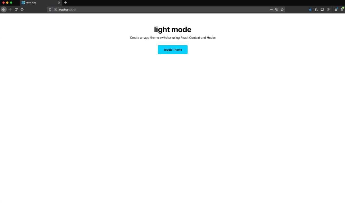
Great, we can see that our ThemeToggle button is rendering correctly. Now we need to build out the functionality for the button to actually toggle between the light and dark themes.
Let’s switch back over to the themeToggle component. To achieve theme switching, we will need to update our selectedTheme every time the button is clicked. For implementation, we will create a function called toggleTheme that updates the mode to the opposite color and then uses that value to dictate which theme is selected. So, light mode will correlate to the light theme, and vice-versa. Then we will use that function in the onClick handler on our button.
Let’s take a look at the updated themeToggle code and then break it down:
// src/themeToggle/index.jsimport React from "react";import { Store } from "../context/index.js";var { useContext } = React;const Index = () => {var [state, setState] = useContext(Store);function toggleTheme() {setState((previousState) => {return {...previousState,mode: previousState.mode === "light" ? "dark" : "light",selectedTheme:previousState.mode === "light"? previousState.dark: previousState.light,};});}return (<buttonstyle={{outline: "none",border: "none",borderRadius: "4px",paddingLeft: "30px",paddingRight: "30px",paddingTop: "15px",paddingBottom: "15px",textAlign: "center",fontWeight: "bold",fontSize: "14px",cursor: "pointer",backgroundColor: state.selectedTheme.primary,}}onClick={toggleTheme}>Toggle Theme</button>);};export default Index;
So there are a few things to note about our toggleTheme function:
- It calls the
setStatefunction to update our currentstate. - It passes a callback function to
setStatethat includes our previous state. React provides access to the previous state as an argument. - It passes our previous state to our newly updated state. We do this so we can retain our
lightanddarkthemes and then only update the values we need to. - It analyzes our previous
modeand updates it tolightif it’s currentlydark, and vice-versa - Likewise, it updates our
selectedThemetolightif the previousmodeisdark, and vice-versa
Let’s make one extra small change. Currently, in our body component, we display “light mode” with static text. Let’s make this dynamic, so it updates every time we click “Toggle Theme.” We will replace “light” with state.mode, which is where our mode label is kept:
// src/body/index.js<h1style={{marginTop: 0,marginBottom: "10px",fontWeight: "bold",fontSize: "40px",color: state.selectedTheme.text,}}>{state.mode} mode</h1>
If we save this and view our localhost:3000, we should now be able to toggle between light and dark modes:
Extra credit: evolving our layout
We now have a fully functioning theme switcher: complete with light and dark modes. At this point feel free to skip to the end of the article ( where I speak to the broader picture of what we have accomplished and different use cases for global state ). If you’re enjoying the ride, I’ll now walk us through creating a more robust layout, so we can see the theme switcher applied to more UI.
To start, in our src directory, let’s create a new folder called card and inside of it initiate a new index.js file. This component will be a standard Card container, and we will use flexbox to style our card layout. Our basic foundation will look like this:
// src/card/index.jsimport React from "react";const Index = (props) => {return (<divstyle={{minHeight: "300px",display: "flex",flexFlow: "column wrap",justifyContent: "center",alignItems: "center",borderRadius: "4px",}}>{props.children}</div>);};export default Index;
We render the children, so we have more flexibility with the content when we use this component. Additionally, we will also want to use our selected theme colors for both the text color and and the background color. We will use the same approach here that we did for the body component:
// src/card/index.jsimport React from "react";import { Store } from "../context";var { useContext } = React;const Index = (props) => {var [state, setState] = useContext(Store);return (<divstyle={{minHeight: "300px",display: "flex",flexFlow: "column wrap",justifyContent: "center",alignItems: "center",borderRadius: "4px",backgroundColor: state.selectedTheme.card,color: state.selectedTheme.text,}}>{props.children}</div>);};export default Index;
Finally, let’s render this Card component in our body component. We will also go ahead and add some content to our Card as well:
// src/body/index.jsimport React from "react";import { Store } from "../context/index.js";import ThemeToggle from "../themeToggle/index.js";import Card from "../card/index.js";var { useContext } = React;const Index = (props) => {var [state, setState] = useContext(Store);return (<divstyle={{padding: "60px",minHeight: "100vh",margin: "auto",justifyContent: "center",alignItems: "center",backgroundColor: state.selectedTheme.background,}}>{/* ... h1 tag and styles here */}{/* ... p tag and styles here */}<ThemeToggle /><Card><h3>Working with React Context</h3>here is my content showing up as needed</Card></div>);};export default Index;
If we check our localhost, we should now see our Card:
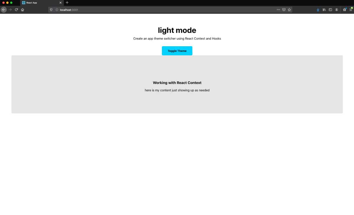
It works, but currently the styling is messed up. Let’s fix that by adding a few more cards to our body component and wrapping them in divs with css grid styles:
// src/body/index.js// ... imports herevar { useContext } = React;var gridStyles = {maxWidth: "1280px",margin: "auto",display: "grid",gridTemplateColumns: "repeat(auto-fit, minMax(240px,1fr))",gridGap: "40px",marginTop: "60px",};const Index = (props) => {var [state, setState] = useContext(Store);return (<divstyle={{padding: "60px",minHeight: "100vh",margin: "auto",justifyContent: "center",alignItems: "center",backgroundColor: state.selectedTheme.background,}}>{/* ... h1 tag and styles here */}{/* ... p tag and styles here */}<ThemeToggle /><div style={gridStyles}><Card><h3>Working with React Context</h3>here is my content just showing up as needed</Card><Card><h3>Using hooks in React</h3>here is my content just showing up as needed</Card></div><div style={gridStyles}><Card><h3>How to achieve global state</h3>here is my content just showing up as needed</Card><Card><h3>Switch color themes with ease</h3>here is my content just showing up as needed</Card></div></div>);};export default Index;
And if we view our localhost we should now see:
Amazing, we now see how easily we can implement different theme colors for all of our UI. As mentioned previously, I’m not going to dig in to the particulars of CSS grid, but if you are interested I would suggest checking out this CSS tricks article. And if you are searching for a greater deep dive, see my article on Modular Layouts in React.
A recap and launchpad for global state
Today, we learned an approach for implementing light and dark modes. But, more importantly, we figured out how to create global state with React Hooks and Context. At this point, we can now enable components to talk to each other and be contextually aware of their neighbors. Some of the practical applications of this method includes:
- creating reactive list views ( with the ability to create, add, update, and remove items )
- creating a shopping cart ( I used this approach when building my Shopify site and I wanted to enable “add to cart” buttons for products )
- querying a database, populating centralized state, and providing data to multiple different components.
And that’s a wrap. Thanks for watching! I hope you have enjoyed this article. If you come up with any inventive ways of using this approach or have thoughts, please get at me on Twitter.